Header
The header (Logo and Title) is the upper part of the app that is always visible and accessible in all sections.
The header serves four purposes :
to display your app's identity
to give the section a title
to display shortcuts
to navigate in the app
To set up your Header:
1. Go to the menu Design & structure > Structure > Sections
2. Click "Header " from the right panel
To access the advanced settings described below, click the Advanced button at the top right corner of the panel.

Note: This online help covers the management of the header's default settings, also known as the general header.
To customize the design of a specific section's header, follow the instructions of this online help.
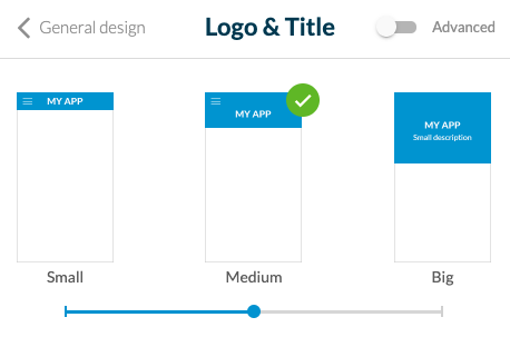
1. Header Height
General settings of your header
Select your header height between 3 templates:
- Small*: displays the title or the logo image
- Medium: displays the title or the logo image (only available for sections in the main navigation of the right panel of your back office)
- Big: displays the title or the logo image + the short description (only available for sections in the main navigation of the right panel of your back office)

* Other sections of the right panel of your back office + all content details pages will always use a Small header template.
Note:
The sections listed below will always use a Small header template unless you set a specific header for those sections:
- Couponing History
- Couponing Saved
- Comments list
- Post comment
- Not Found
- Login Box
-TabBar other
- Private profile + Profile edition + Profile settings
- User Search + Filter View
- Submit post views
- Search section
- Any Minimal templates
- Map section (All views) (Hiding effect can’t be applied in this section)
- Chat section (All views) (Hiding effect can’t be applied in this section)
- Custom section (Hiding effect can’t be applied in this section)
- Plugin section (Hiding effect can’t be applied in this section)
- Templates scratch and slideshow of Node section (Hiding effect can’t be applied in these templates)
- QrCode Section
- Settings sections
- Live (All live sections)
- Loyalty card all views
HTML and Plugin sections always use a Small header template

Warning: There is no header displayed at all on the map views of the Events and User list sections.
2. Logo
1. The central part of the header allows you to give a title to your app or to a section. This title can be displayed in the form of text or a logo (image).
- Text: click the text to edit it.
- Logo: click the "Logo" button to add an image* in the place of text.
*Respect the minimum size requirements of 800 x 200 px.
2. Select the color and font of your title
3. Alignment: Position your logo or title to the left or at the center of the header.
Note: In the Chat details and New message, Comment List and Post Comment, QR code scanner, Photo details, Edit Profile and Profile Settings, Profile Push List and Settings, User Search Result and User Advanced Search pages, the logo/title will always be centered.
3. Advanced Settings - Short Description
In the Logo menu, if you selected a Big template, you can set a short description that is shown in your header above the logo of your app.
Fill in the short description of your general header and set the text font and color.
Fill in the short description of your general header and set the text font and color.
4. Advanced Settings - Options for the Title
In the Logo menu, you can set the display options for the title. This option defines the header display strategy.
1. Select "Logo only" to always display the logo set in your general header on all your app pages.
or
2. Select "Section title & description" (Big template) or "Section title" (Small and Medium template): Update your header title depending on the page of your app that is displayed, to use automatically the title of the section involved.
To set the description of a section if you're using a Big template:
- Go to the menu Design & Structure > Structure > Sections
- Open the settings of the section involved
Note: In the main navigation of your app, the first section of your list will always use the title/description of the general header.

5. Advanced Settings - Menu & Back Icons
The left part of the header is used to display the navigation actions.
Set the design of the "Menu" button (icon + color).
The navigation menus Swipe, Little Swipe, Grid, and Slate provide a menu button displayed in the header and allows access to the content.
The navigation menu TabBar this button will not appear.
Set the design of the "Back" button (icon + color)
This button is used to go back to previous sections inside your app.

6. Advanced Settings - Header Background
Select the colors of your header background.
Set a background image (1242 x 192 px) for your header background (available for Small templates only).
7. Advanced Settings - Scroll Effect
When you scroll down your app pages, you can set different effects for your header.
No effect: available for Small, Medium, and Big templates.
Hiding: available for Small, Medium, and Big templates; the header is hidden when you scroll down the page
Resize: available for Medium and Big templates; the header becomes smaller when you scroll down the page
No effect: available for Small, Medium, and Big templates.
Hiding: available for Small, Medium, and Big templates; the header is hidden when you scroll down the page
Resize: available for Medium and Big templates; the header becomes smaller when you scroll down the page
8. Advanced Settings - Actions in the Header
Add shortcuts on the right side of the header.
1. Click the green + icon to add an action.
2. Select in the link drop-down menu to which page your users will be redirected when they click this action.
3. Edit its color and icon.
4. You can display a title for the shortcut for iPad and desktop and display the shortcut in the form of a button for desktop only.

Note: Only two shortcuts are displayed in the header; if you add extra shortcuts, they will be accessible from the second shortcut (additional menu) for your users.
Related Articles
Section Design
By default, your application has a global style applied to all your app's pages. To modify colors, fonts, backgrounds, formats, etc... of each element of your application: 1. Go to the menu Design & Structure > Structure > Sections, which will show ...Header (eCommerce App)
The header (logo and title) is the upper part of the app that is always visible and accessible in all sections. The header serves 4 purposes : to display your app's identity to give the section a title to display shortcuts to navigate in the app To ...Design the Categories of your Section
Depending on the type of content you have on your app, you can add categories to your CMS content section or filter your external content when using an external source (Youtube, WordPress etc.). Please refer to this online help for more ...Design the Categories of your Sections (eCommerce App)
Depending on the type of content you have on your app, you can add categories to your CMS content section or filter your external content when using an external source (Youtube, WordPress, etc.). Please refer to this online help for more ...Global Style (eCommerce App)
The Global Style menu manages your app's overall design from one single menu. Colors, fonts, and effects chosen in this menu are applied to every section of your app. WARNING! Very important: When applying your global style to your app. If you had ...